It’s not new that the shelfie trend has gained momentum once again and as it may sound simple, there’s an art behind on how to display your adored possessions if you want them to work as nice as you are thinking of. Whether vertically, in horizontal stacks, or a combination of both, we want to show you how to achieve the right visual pattern for your shelf.
We need to keep in mind different factors like size, colour, subjects and of course the shelf itself. It’s not about having it all be so “perfect” that no one wants to touch it – it’s more about the right balance of making them look good but also enjoyable.
Pick the Right Bookshelf
Even though the style and size are important factors to consider, you also need to think about brands, material, installation, etc …. Koala has recently launched their living range with great bookshelf options. The Koala Bookshelf is available in 3 sizes: Tall and Wide, Tall and Narrow, and Short and Wide. It’s made using PEFC certified timber you can admire your styled bookshelf knowing that it’s made entirely using sustainably sourced materials. Plus you get free 4 hour delivery, and a 120 night trial!
If you want to get your hands on the Koala Bookshelf, or any of their other products, use our code MATESWITHCAVIARFEELINGS for 10% off anything!
Mixed Objects
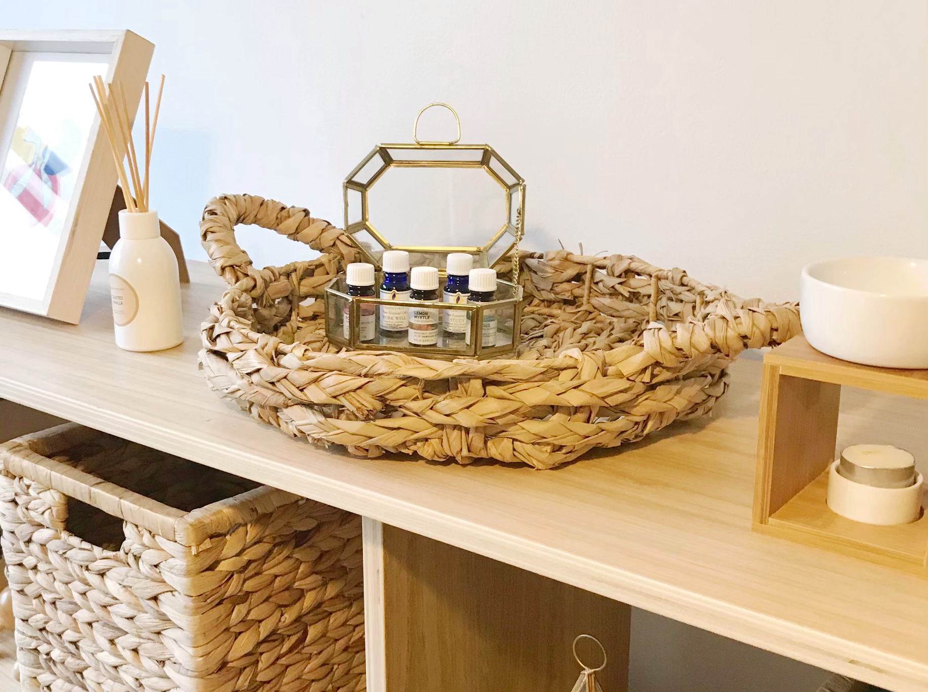
Use a mix of objects and colours to add more contrast, texture and scale to your shelf by making your skating appear effortless. Deco objects like boxes, baskets, bowls and of course flowers are always great options to add.
Artwork
Most of the people forget to style their bookshelf with artwork which I personally think that could be a mistake, as a small/medium frame or even a large piece from the edges of the shelves will make your room look more stylish.
Pick a Colour Scheme
Sometimes is a good idea to take time and think about the colour panel you want to run through the shelves as it’ll make everything more cohesive and better looking.
Layer Things
Use something tall, something small, something stacked and create a nice-looking focal point as a whole. Using deco objects together to create a whole piece or set is way better than having 2 or 3 items separated.






you g
June 20, 2020 6:40 amHowdy I am so glad I found your website, I really found you by accident, while I was searching on Google for something else, Nonetheless I am here now and
would just like to say cheers for a incredible post and a all round interesting blog (I also love the theme/design), I don’t have time
to go through it all at the minute but I have bookmarked it and also added your RSS feeds,
so when I have time I will be back to read a lot more, Please do keep up
the awesome work.
g https://tinyurl.com/rsacwgxy
June 22, 2020 6:22 amValuable info. Fortunate me I discovered your site by chance, and I am surprised why this coincidence didn’t happened earlier!
I bookmarked it.
tinyurl.com
June 26, 2020 6:05 amWhy viewers still make use of to read news papers when in this technological world the whole thing is available on net?
cbd oil that works 2020
June 27, 2020 4:59 pmHey very interesting blog!
cbd oil that works 2020
June 27, 2020 5:31 pmPretty great post. I just stumbled upon your weblog and wanted
to mention that I have really enjoyed browsing your
blog posts. In any case I will be subscribing for your feed
and I am hoping you write once more very soon!
cbd oil that works 2020
June 27, 2020 9:10 pmGreat web site you have here.. It’s hard to find good quality writing like yours nowadays.
I truly appreciate people like you! Take care!!